
Like it or not, we DO judge books by their covers

Using subtle cues to communicate key messages about your brand.
My definition of healthy is probably different to yours. With so many options available – low calorie, low fat, low sugar, low carb, high protein – not to mention all the healthy (and trendy) supplements – matchalatte, turmeric latte, fennel tea to name a few – it’s no wonder it’s a slightly bewildering space that consumers somehow need to navigate.
Add to the confounding nature of ‘health’ other values that consumers seek from the products they engage with, like quality and sustainability, and it’s a minefield. It’s almost a miracle consumers purchase anything at all. So we decided to look at how they use the cues brands give out to do this.
We’re going to leave the definitions of health to the professionals and instead look at how consumers are able to make decisions and purchase something that they can convince themselves they’re happy with.
To do this, we’re going to turn to the field of semiotics, which is the study of signs and symbols and their use or interpretation. More specifically, how using these signs and symbols in branding and packaging can communicate key intrinsic messages about the product as well as the brand.
But first, we need to understand a little more about why semiotics in branding and packaging is important.
Why semiotics influence consumer behaviour
Quite simply, consumers are lazy and don’t have the time or inclination to conduct extensive research into the category. Instead they (subconsciously) look for shortcuts, something that will instantly tell them what the product is or what the brand stands for which enables consumers to quickly navigate multiple products on shelf. These shortcuts are the signs and symbols that a brand uses to communicate.
Consumers are looking for brands that align with their values, their aspirations, their desires. If they spot this on the shelf, then the consumer is moved from interest to purchase almost without ‘passing’ through the consideration and preference funnel. However, if the packaging fails to do this, the consumer is forced to make a decision: investigate further or move on to something else. Unless they have a very good reason to investigate further (such as a recommendation from someone they trust), the likely outcome is that they move on.
The signs and symbols a brand deploys are a critical component in the marketing toolkit.
Using semiotics to communicate key messages
Understanding the semiotics of a category (the signs and symbols that consumers naturally use to navigate the category) thus provides an insight into what a brand can do with their own symbols. For example, a brand may choose to use the category norms to ensure consumers know what the brand or product stands for. Conversely (and rather more riskily), a brand could choose to buck the category cues in an attempt to disrupt the category and get consumers to re-appraise how they shop that category.

An example of this is when Ella’s Kitchen launched their range of baby food in pouches, a new format for baby food (before that the food was typically in glass jars). Initially the Ella’s Kitchen team faced a lot of resistance from retailers to the new format, but it eventually managed to cut through and nowadays Ella’s Kitchen has 30% share of the UK market. (Ironically when they tried to launch Paddy’s Bathroom, a bubble bath range for kids, in pouches they were told that pouches were associated with baby food – their own success had shifted the semiotics of the category!)
(Side note: it is harder for an established brand to buck the category norms as they already have their own brand cues and moving away from these and disrupting the category may bump them out of awareness).
Furthermore, semiotics can reflect current culture and how consumers feel about certain cues, colours, fonts, symbols, styles etc. It is ever evolving as new brands push boundaries, challenge the category and change expected norms, as evidenced with the Ella’s Kitchen example.

Another example is lavender in the beauty industry. Today lavender is touted for its benefits, specifically in relaxation. Packaging seldom mentions lavender itself (and if it does it’s rarely front and centre) and instead uses deep purples and language such as ‘chill, relax, and wind down’ to cue lavender. This is in direct contrast to how lavender used to convey a grannies’ floral powder with cues such as pale mauve, old style fonts and detailed visuals of lavender plants.
Decoding The Health Category
For illustrative purposes, we decided to look at the semiotics of the health foods category. While not an exhaustive list, below are some examples of how ‘healthy’ is conveyed to consumers through different cues.
Words and language
Brand names and copy are natural and obvious cues. Without looking further, they instantly cue for what the brand and product stand.

Colour
Colours cue associations both immediately and sub-consciously. They elicit a feeling, for example lighter tones cue lightness and balance, warmer tones such as orange and red are bold and cue confidence and excitement, while green is more associated with calm and relaxation.
As such, cues in the health category have typically employed lighter or earthier tones associated with nature – raw materials, light greys and whites, or clear packaging.

DNAFit’slighter tones coupled with greens that cue nature, such as leaves and grassy fields clearly promote health. Using these familiar colour cues means DNAFitcan take a complicated science (using DNA tests to inform diet and fitness regimes) and make it feel accessible to the masses.
As the definition of health has evolved, we’ve seen increased use of black to convey strength, a colour not historically associated with health. Strength is one of the newer interpretations of health, as the category moves away from ‘skinny’ as the only interpretation – just think about the rise of the hashtag #strongnotskinny.

KIND bars cleverly use a combination of black as the key colour to convey strength (supporting the high protein claim), primary colours to promote vitality and energy, a name that automatically cues that it’s good for your body, and copy that makes the science behind the product accessible (‘ingredients you can see and pronounce’).

Graze boxes, on the other hand, since their launch have used raw cardboard in their primary packaging as their cue to natural, wholesome ingredients. Historically this sort of packaging wouldn’t have been used for consumer goods for fear it wouldn’t stand out on shelf, however this is now a common cue for natural and organic.
Fonts
Fonts are another cue that send messages about a brand and its values, for example thin fonts imply health and diet by subconsciously replicating the form someone watching their diet strives for.

Strippd uses thin fonts in combination with lighter tones to clearly convey that their product is an all-natural and lean protein powder.
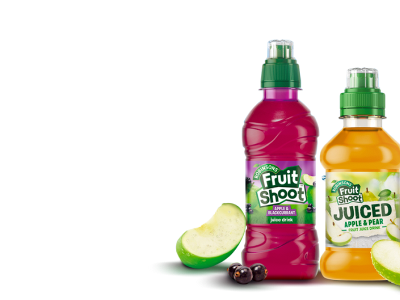
By contrast, Fruit Shoot uses chunky fonts with bright colours and imagery, which clearly communicates to a different target audience (kids) with different benefits (energizing real fruit).
Imagery
An obvious semiotic cue is the imagery that a brand uses, not only on its packaging but also in its advertising and communications.
A trend in health, as well as across other sectors, is for aspirational imagery; imagery that is designed to delight, for the Pinterest andInstageneration.

The premise of Pack’d is that all you need to do to quickly get a healthy, natural smoothie is add your preferred liquid to their frozen fruit and vegetable pouch and blend into a smoothie. Smoothies are by nature Instagram ready, so with bright, refreshing imagery of the fruits and vegetables in the pouches, Pack’d encourage food photography.
Alternatively, innocent or playful imagery can cue transparency.

T+ Tea uses bright colours with playful imagery and names such as ‘Immunitea’ to convey that the product is pure and that they have nothing to hide.
Pack designs and formats
The primary packaging of a product also contains important clues. Like with fonts, tall thin bottles or boxes convey health and diet. Sculptural designs can depict smoothness of product. Bottles that are reminiscent of apothecaries communicate that the ingredients are specifically formulated to deliver health benefits.
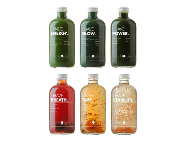
Body + Eden’s apothecary shaped bottles clearly support their proposition of ‘raw tonic herbs naturally fermented with probiotics’. From first glance, one is given the impression that the tonics are nourishing and nutrient rich with medicinal benefits.
See-through packaging (or even see-through windows) allow consumers to see the product, which promotes transparency and purity.
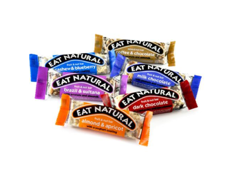
Eat Natural bars allow the consumer to see exactly what they’re getting – clear primary packaging means there is no hiding what the product is.
Summery
As the examples illustrate, cues must support and not contradict each other to ensure that a consumer gets a clear sense of the brand or product immediately on experiencing it.
To summarise, semiotics provide a toolkit that enable a brand to pitch packaging at the right angle for their target consumers to read the desired message.It can be used to inform:
Pack format (shape, size, texture)
Colour
Labelling
Copy
Communications